
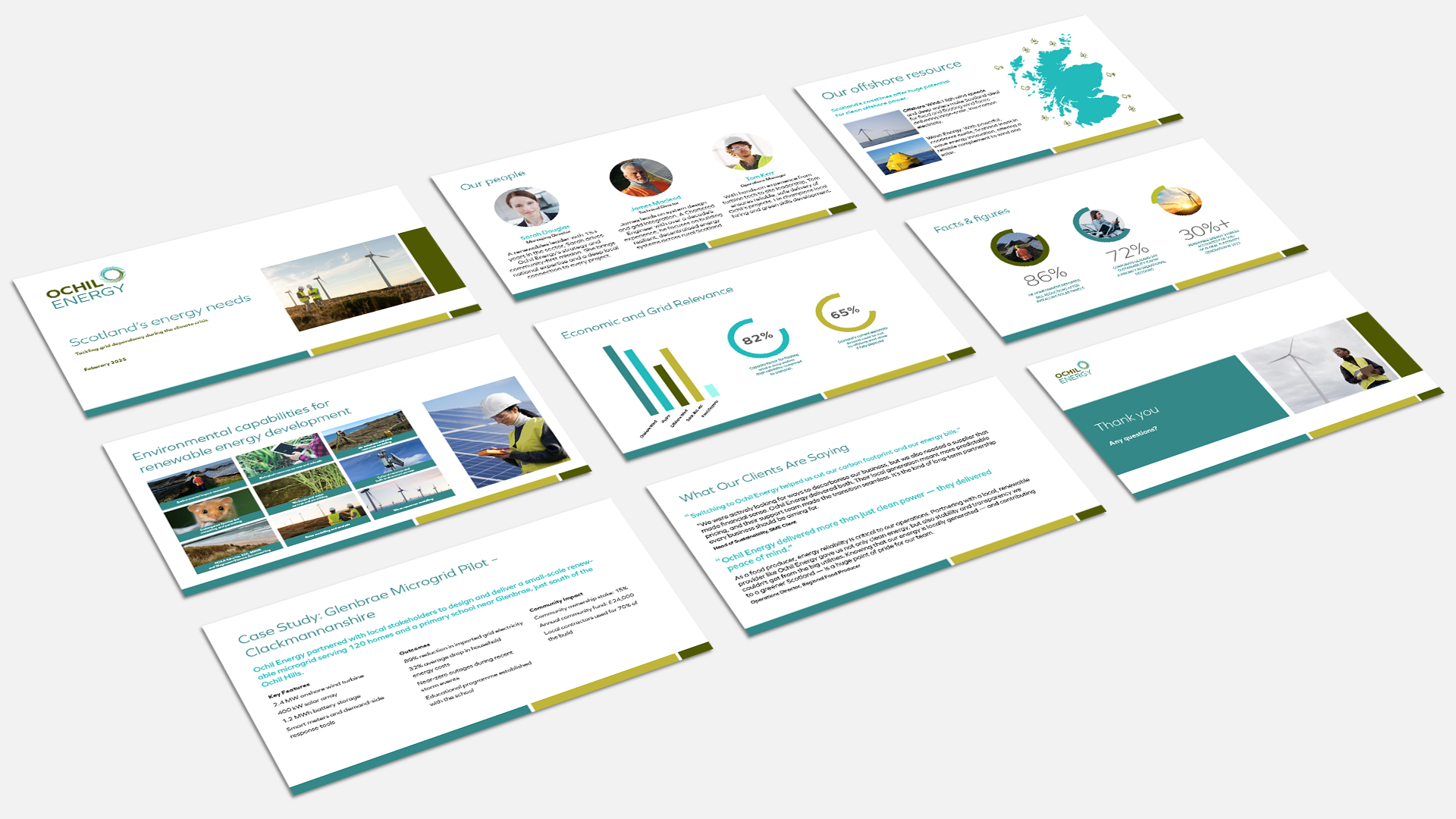
Ochil Energy is a new Scottish energy company focused on delivering sustainable, accessible, and intelligent energy solutions to homes, businesses, and communities. As a startup entering a competitive space, they needed a full visual identity and website that reflected their values of innovation, transparency, and local trustworthiness—while also standing out as a modern, mission-driven brand.
The goal was to create a look and feel that would position Ochil Energy as both credible and community-focused, appealing to a broad audience ranging from homeowners to enterprise clients.
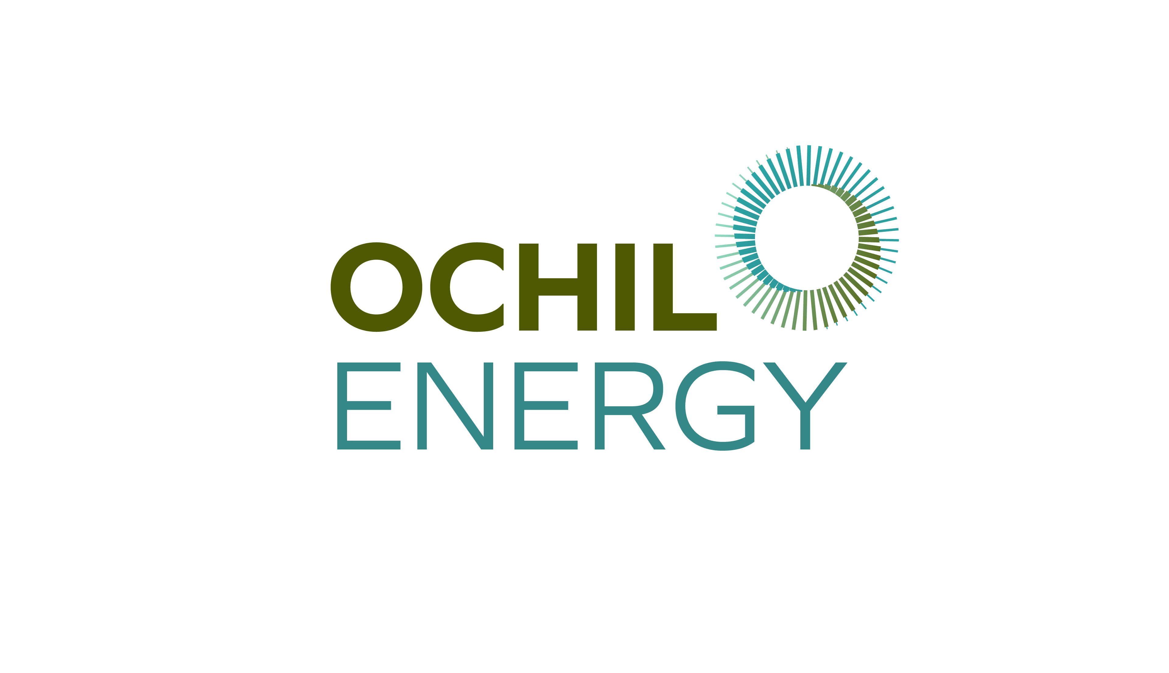
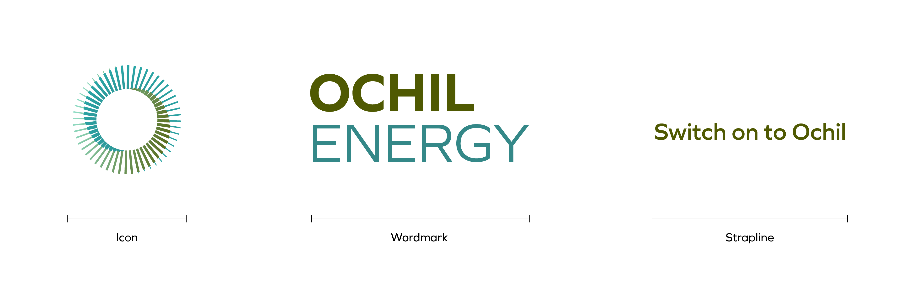
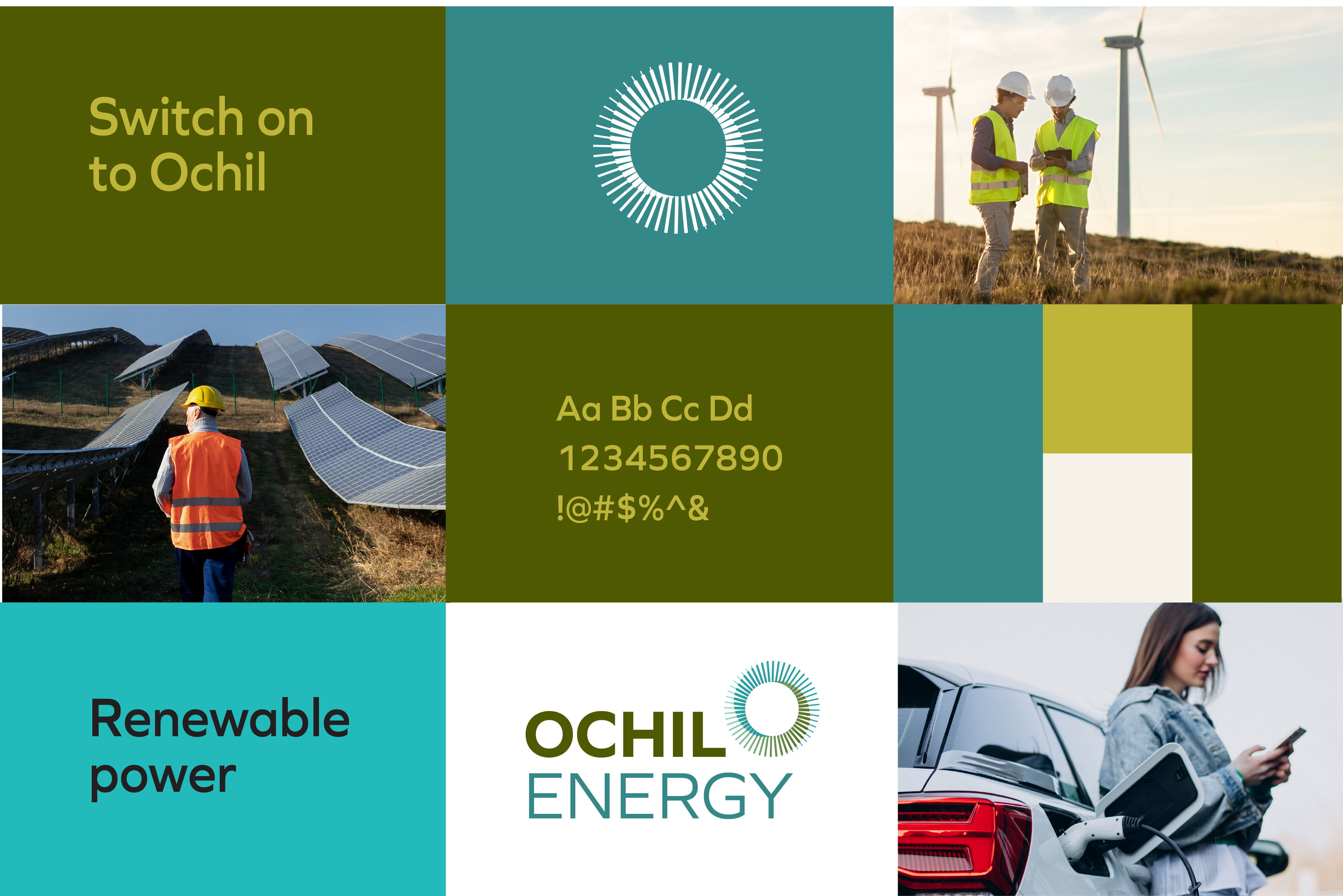
The visual identity incorporates organic shapes, muted earth tones, and clean sans-serif typography, paired with abstract representations of sun, wind, and the passage of time. The Ochil logo is a custom wordmark paired with a modular icon system designed for use across print, web, and product applications.
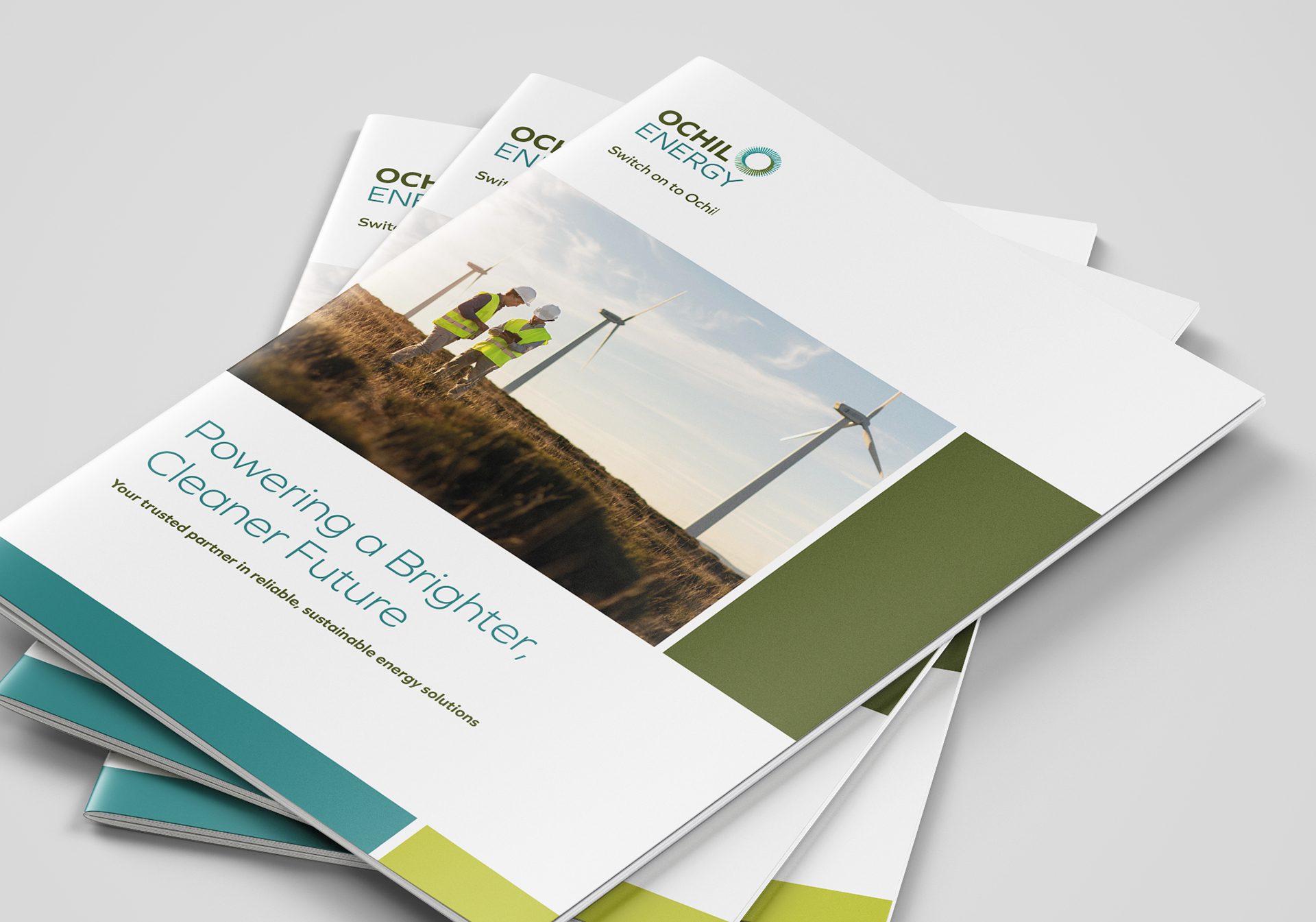
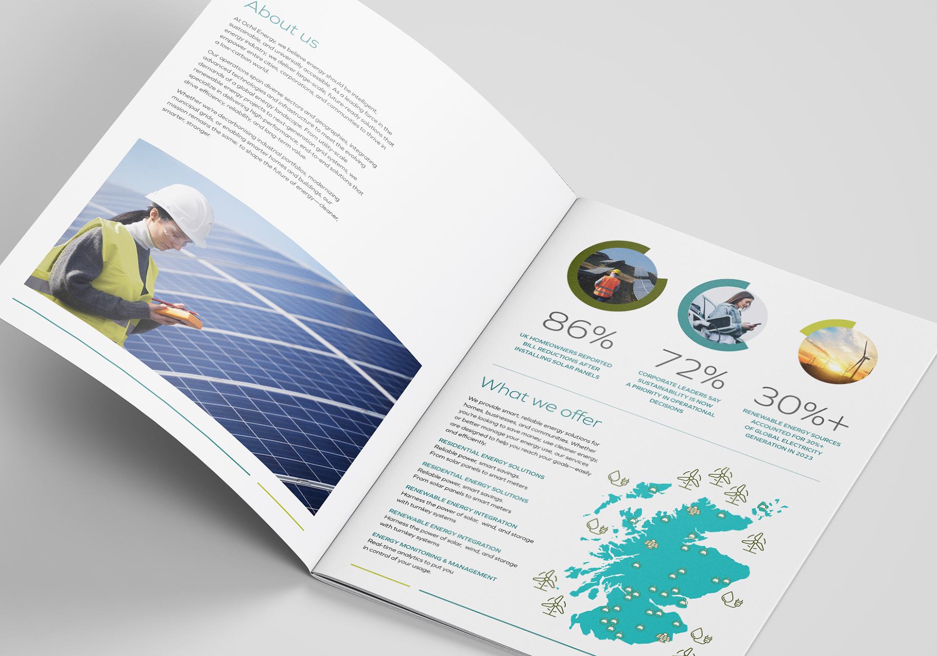
The branding helped Ochil Energy launch with confidence, setting them apart as a trustworthy new player in the UK energy market. The cohesive identity and user-friendly website have become essential tools for communicating their services and values—while building a brand that’s ready to scale.

Ready to bring your brand to life? Let’s create something great together.


